3 Tips for Designing in the Healthcare Industry
One of Echobind’s strong suits is designing and developing applications for the healthcare industry. As a designer at Echobind, I have learned that there are special considerations when designing for the healthcare industry.
Hopefully, these three tips will help if you are ever challenged with the task of healthcare design.
1. Keep it Clean and Simple
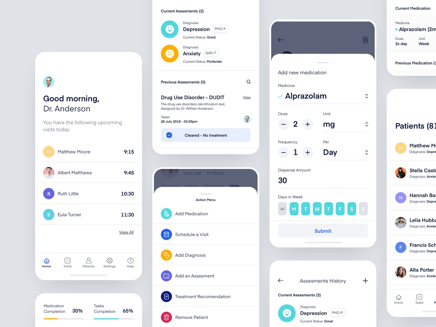
User experience is the utmost importance in my opinion when it comes to healthcare. The designer in me wants to try new things and see how I can up my design skills even more but then I have to keep in mind that the users of this app will most likely be focused on getting a task done or consuming information.
Below is an example of great formatting and spacing. I really appreciate the simple colors with good contrast and clear actions.

2. Imagery
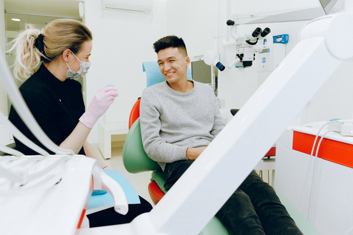
Have uplifting images in place as opposed to a gory scene from E.R. will surely create a more upbeat feeling. Picking the right pictures will set the tone for your design. Even though it can be difficult at times to find these types of images, it is definitely worth doing so.
Here’s an example of a patient smiling while getting some work done. Notice how his facial expression lights up the mood in this photo. This creates a happy tone and adds to the overall look and feel of the design.

3. Color Palette
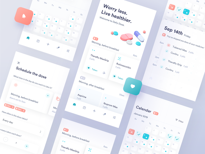
This may seem obvious but to keep with the happy/uplifting vibe, the color choices should also reflect that to help carry the mood across the entire app. Choosing bright colors with soft shadows and rounded corners is a great baseline. As you can see in this example picture below, the soft white is a staple for hospitals.
Also, note that the black color is more of an off-black mixed with a lighter purplish hue. That helps with keeping it light and is not as bold as pure black. If you mix in light pastel colors for contrast like the peachy orange, turquoise, and lavender you have yourself a great color palette that conveys a happy mood.

These tips that I’ve learned over time have really helped me with designing for the healthcare industry. Hopefully, I can inspire a few other designers and make their decision and thinking process a little bit easier. Happy designing!
Learn more about Echobind's Healthcare capabilities.


