A Typeface or a Font — which is right?
The origin of Typography has deep roots but many of the terms used today can be traced back to print before even 1880. The use of Typography has evolved and grown over time. It is now used in many different industries and disciplines including graphic, motion, and product design (UI/UX). This widespread use across disciplines leads to some of the terms being used interchangeably.
Four common terms used interchangeably across design are type, typeface, font, and font-family. Depending on what industry you are in and who you are speaking with, they may use one or the other. Which are very similar but have subtle differences.
When you look at different pieces of Typography any party will generally agree that it has an identity, a style, a weight, and a size.
Typeface
The identity is associated with the typeface. A typeface is a particular design of Type that has the same visual consistency and characteristics across all characters.
There are hundreds of typefaces but here are a few examples:
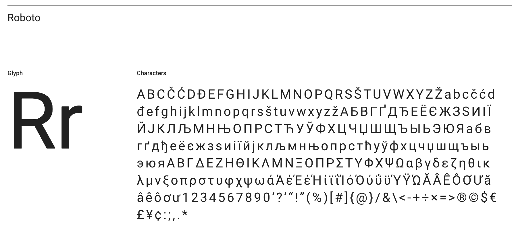
- Roboto
- San Francisco
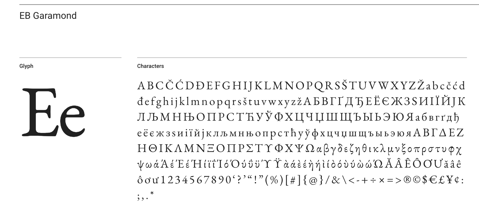
- EB Garamond
- Helvetica Neue
- Times New Roman
- or Brush Script
Type
Type refers to an individual or collection of characters of a typeface. It comes from the time when letters (a character) were printed onto a single block of metal and used in a printing press. Also, think about a typewriter — there is a reason it was so purposefully named. It has individual characters printed onto metal rods that when pressed will stamp that character onto a piece of paper.
Weight
Weight is the increase or decrease of the stroke on a type that results in it visually appearing heavier or lighter.
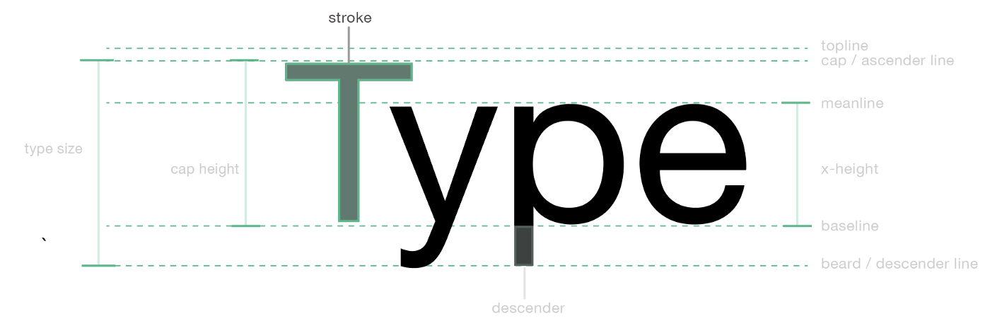
Stroke of Type
Style
Style can be considered things like italic, regular versions of a type. It is also acceptable to consider the various weights of a Type to make a new style.
Font
A font is a particular variation of a typeface’s weight and style.
Another thing to note, since the invention of desktop publishing is font also refers to the actual font files on the computer. So working within digital design people would see the word font and not typeface. In addition, many programs from that time until now use the word font. They combined the picking of a typeface and font into one action.
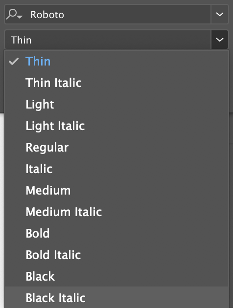
These are examples of fonts from a typeface like Roboto:
- Roboto Thin
- Roboto Light
- Roboto Regular
- Roboto Bold
- Roboto Black
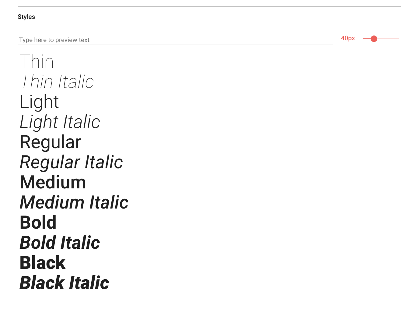
Fonts available in google fonts for Roboto
Font-Family
Font-family is the collection of Fonts.
The font-family of Roboto would be the collection of fonts like Roboto Thin, Light, Regular, Italic and Bold. There are more fonts in Roboto that we did not mention. And not all Typefaces have all these fonts in the font-family. But the main takeaway here is that Typeface is what we see its how we identify Type and Font is the variation of Type that we use.
What I have come to notice is people who have a background in graphic design, print, and sending designs to print may hear or use the word typeface. As opposed to those who mainly work in like software, web, or product design (UI/UX) may use the font. The division is not so clear cut, as camp A and camp B and I am surely not trying to promote that. Because I have heard graphic designers use, font and mean typeface. Product designers use, typeface and mean font. And developers use font-family and mean typeface. Hey, everyone does it.
Using the terms interchangeably is ok for the most part outside of print and type design. However, it’s good to know the difference so you can understand or use the correct terminology within the appropriate context. This will help you effectively communicate with people from all backgrounds and design disciplines. And if you need clarification or you think there is some miscommunication, just politely ask the person and talk it out.
I think this covers the design to design communication. But there is another channel of communication in product design where things can get murky and that is between designer and developer.
Tip for working with developers
A designer may say “that font is supposed to be bold” and a developer may ask “what font-weight number is that”. The reason being as a designer you will see the Font listed by the description in your design tool.
However, when a developer goes to use that Font in a project it may be referred to by number and not description.
So for example:
- Roboto Regular equals font-weight 400
- Roboto Light equals 300
- Roboto Bold equals 700
And there are numbers associated with the other fonts in the font-family as well from 100–900. So if the developer asked that question and the designer does not know just ask them to see how that number corresponds to the font description.
Here is an example from Google Fonts.

This is a question that sometimes comes up when designing for the web and even mobile. If you hear that question you will be prepared.
One thing that helps with the communication of typeface and fonts is a type specification. A Type specification can be provided to the developer within your Style Guides or Design System.
Here is an example of how to write a type specification:
- Typeface — Roboto
- Font-Family- Roboto Bold, Roboto Regular
- Heading: Roboto Bold — 40 / 44 ( 40 being font-size (aka type-size), 44 being line-height (aka leading) )
- Paragraph: Roboto Regular — 20 / 30
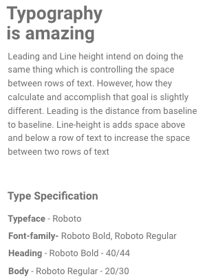
Sample image of type specification
The type spec will communicate information like the typeface, fonts (weights), and size. Along with other information like line-height (leading) and letter-spacing (tracking). Helping to smooth out the designer to developer communication.
Wrapping up
So all in all, knowing the difference between type, typeface, font, and font-family will empower you to speak, a unifying design language.
Just remember:
- A typeface is how we visually identify a Type.
- A Font is a variation of Typeface’s style, and weight.
- And those Font variations are what we use and make up a font-family.
Will people still use them interchangeably between disciplines, industries, and languages? Probably. But will you still design awesome things at the end of the day? Yes. The main goal is not to bicker over terminology but to work as a team and design things that communicate.
There are hundreds of great typefaces to choose from and if someone says font it is ok. Regardless of the typeface or font you decide just remember the main function of Typography is the readability, legibility, and the hierarchy of information in Design.
Just pick a typeface, write good copy, and structure it well in your design and you will be on your way. Continue to be creative and enjoy what you do.
Keep Creating. Keep Innovating. Keep Designing.