 Back
BackProduct Design ft. Hello, Startup — the Visuals
Product Design ft. Hello, Startup — the Visuals
In the previous part of this series, we dove into the beginning stages of product design with Hello Startup: user-centered design. In this installment of the series, we’ll go through the next stage which focuses on the visuals and how we present to the user.
Visual Design
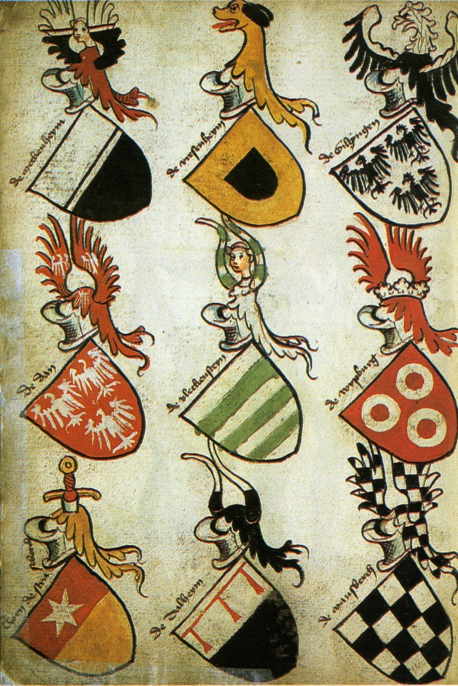
15th-century German coats-of-arms. Via Wikipedia
People have been doing visual design for some time now, or should I say a long time. Have you ever thought of a coat of arms as being visual design? It was developed in northern Europe in the mid-12th century for the purpose of identification. It evolved into representing family descent, alliance, profession and more.
The coat of arms became a symbol of recognition that was memorable and could leave such an impression that it could instill fear on the battlefield.
In this part of the chapter, Hello Startup introduces us to the techniques that will help us get started in creating designs that will be memorable and leave an impression on those who see it.
Before diving into anything complex its essential that one becomes familiar with basic visual design skills.
1. Copywriting
Since most people think of design as colors, animations and pictures it comes as a surprise to novices that copywriting is a part of it.
… the real core of almost all software design is is actually text. In fact, you could remove the colors, borders, pictures, and just about everything else from most applications, and as long as you left the text, it would probably still be minimally usable. — Yevgeniy Brikman | Hello, Startup
It’s not that the other elements don’t matter, but users get most of their information in the titles, menus and so on. This is why Hello Startup suggests that when doing visual design, copywriting should be the first priority. Take the time to think about what you’re going to say to the user and how — remember our discussion on emotional design from the last part of the series?
It’s common practice to design with the usual filler text “lorem ipsum”. Because of this, we end up focusing on the text that will fit the mold we’ve shaped instead of focusing on “writing a message that resonates with your audience.”
2. Design Reuse
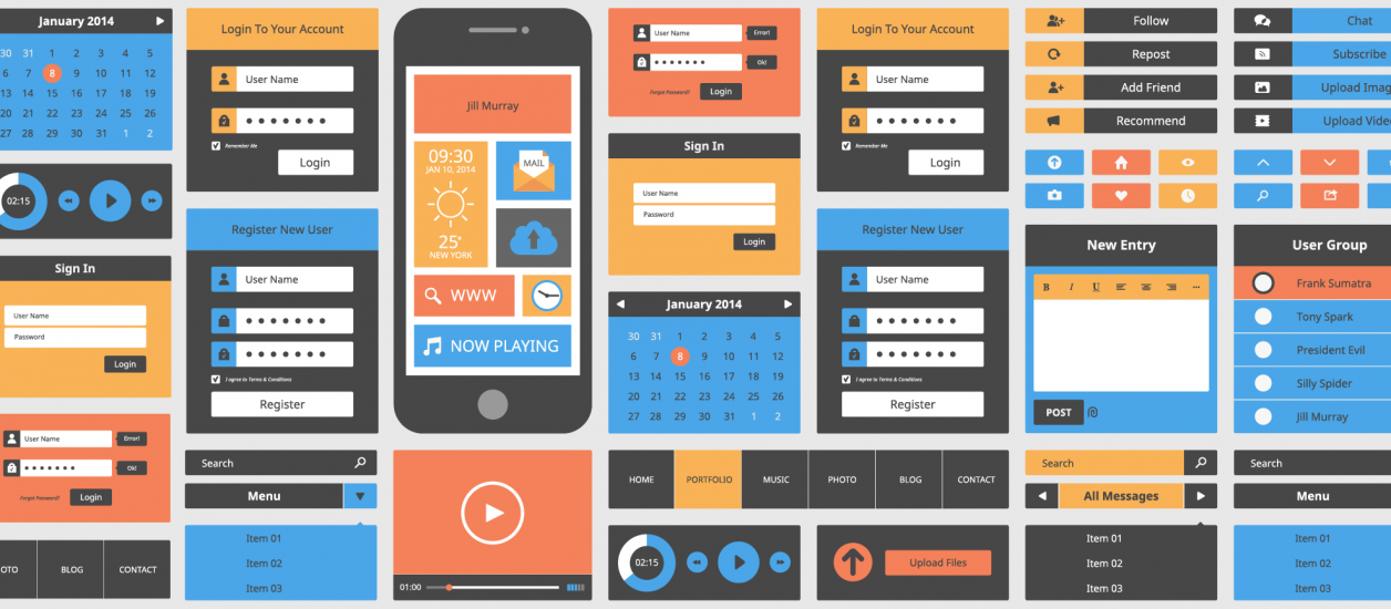
Screens from successful mobile apps. Via Adobe
When it comes to design, especially if you’re new, don’t try to reinvent the wheel. If you were to observe various applications and websites you’ll begin to notice common design patterns. When you know something works take advantage of that.
That’s not to say your whole project should be a copy and paste of someone else’s work, but by mimicking others and eventually reusing your own designs you not only learn but also save time. This might sound familiar if you’ve read the first part of the series for product design. “Copy, transform, and combine are the basis of all creative work.” Do a bit of searching on Dribbble and you’ll notice some similarities while the designs still maintain their own sense of identity.
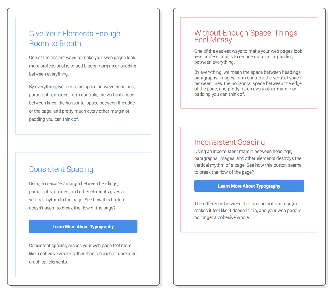
3. Layout
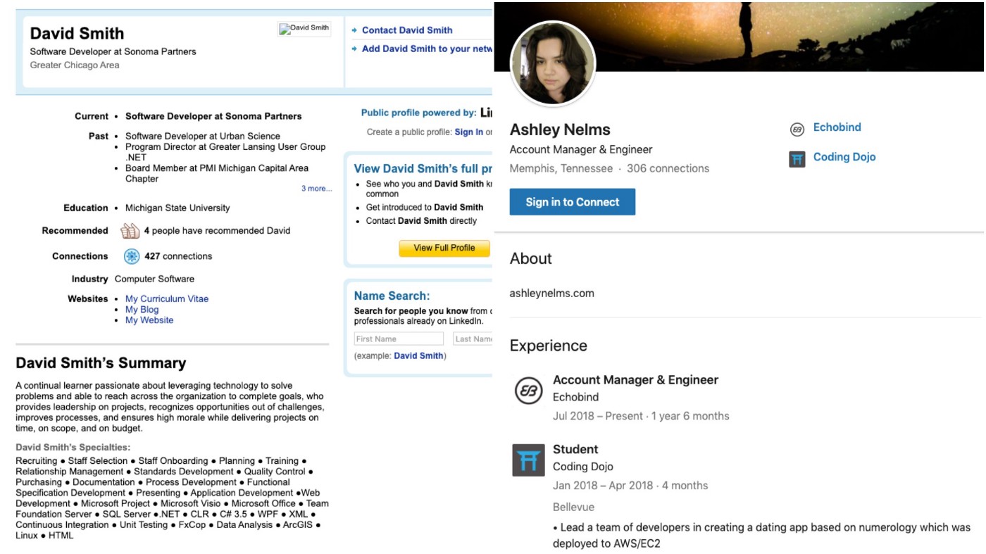
A good layout arranges what’s on the screen in a way that conveys useful information to your audience. We’ve become so accustomed to it that it’s not something we think about anymore until we have to build it ourselves that is. Let’s use LinkedIn as a reference for the next two points.
One of the aspects of design is proximity which “indicates if elements are logically related or not.” This means unrelated elements should be further apart. The other aspect is alignment which “allows you to communicate that there is a relationship between elements.”
Below is a comparison of what LinkedIn looked like in 2010 and what it looks like now. Just at a glance, there is a significant improvement — the call to action is more prominent, the information is condensed and the summary (about) is closer to the top. The human mind can only process so much information at once. With the old version, a lot of information had to be consumed before you could get what you want or even see the user’s experience history.
4. Typography
Hello, Startup describes typography as the art and science of arranging text so that it is arrangeable and beautiful. As with layout, typography has its own essential aspects.
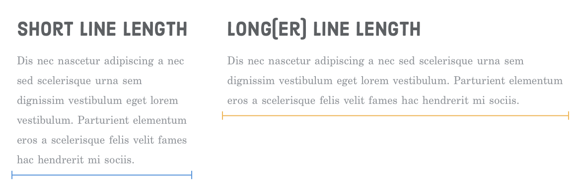
Measure refers to the length of each line. It’s not about the abundance of information but how it’s presented to the user. Margin, alignment, and characters per line all play a part.
Leading refers to the vertical-spacing between each line. Too little or too much and the user will have a hard time reading the displayed information.
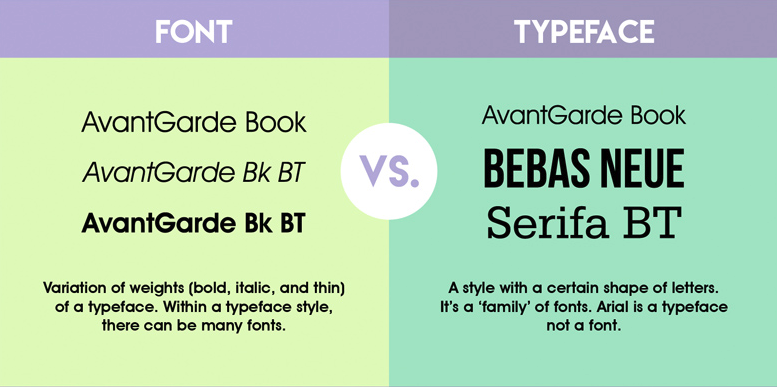
A typeface is the design of the letters. Although every operating system comes with some built-in, Hello Startup points out that one of the simplest ways to dramatically improve your designs is to steer clear of these. Many better-looking alternatives can be obtained for free and this resource here goes further in-depth.
Style refers to the way you can alter the look of a typeface including text size, thickness, letter spacing or capitalization. A certain combination of typeface and style is a font, although the terms are incorrectly used interchangeably.
5. Contrast and Repetition
Contrast helps to build consistency as well as directing attention to more important parts of the design. In the LinkedIn image above, you can see the fonts are consistent for headers, sub-headers and so on and have emphasis where needed. At Echobind, we enforce this design technique through the use of template styling. This ensures all related elements follow the same rules and bring cohesion throughout the app.
6. Colors
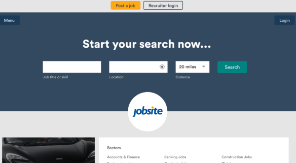
Colors not only make something look pleasing to the eye but it can help direct users without the need for words. Take this screenshot from Jobsite below. Using contrast effectively they’ve made the call to action stand out to the user. At a glance, before even reading the button’s text the user will know the purpose and what they should do after filling out the form.
Up Next
In the next part of the series, we’ll continue through Hello Startup’s chapter on product design, this time focusing on building the MVP with what we’ve learned about user-centered and visual design. Remember, this is only a fraction of the valuable information that can be found in this book and I highly recommend picking up your own copy for more in-depth explanations and examples.
Until next time!