Advantages Of Dark Theme User Interfaces
I truly appreciate the dark theme user interface (UI) since it saves my eyes from unnecessary strain. In fact, my eyes are straining as I write this very post. It looks like I will have to enable Dark Theme for Medium by getting this extension. Dark themes make reading and browsing content at night enjoyable. Usually, when I’m texting or using apps, I have the brightness all the way down due to the constant glare of the white background. It fatigues my eyes rather quickly. With sites and apps adopting the usefulness of dark themes, I reap the benefits.
How Dark Theme Translates to Design
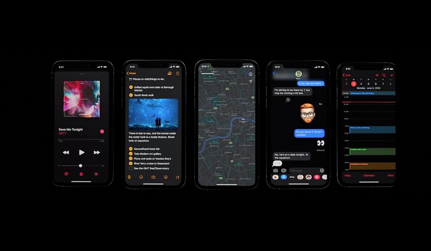
Dark theme UI has made me reconsider how I think about design. For example, having high contrasted headlines grabs the attention of the user. As a designer, this is a great tool to use because it gives me a bit of leverage to guide the user to read or see what I deem the most important. Also, the use of highlighting rows/columns and graphical elements can set a visual hierarchy that further routes the user into seeing what you envision from the start. It also accentuates certain parts of the UI while masking others.
Adding a Sense of Drama and Emotions
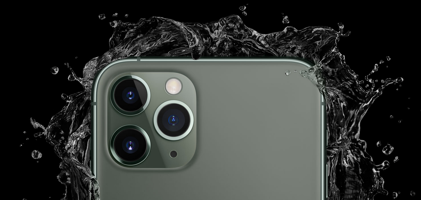
Dark theme UI evokes drama and emotions. For example, having a dark background with grungy textures overlaying with bold type treatment and an intimidating image can evoke a sense of anxiety and hopelessness about a certain design. On the other hand, you can have a dark background but with a bright, colorful image like Apple’s iPhone which then gives off this luxurious and bold feeling. One consideration for designing dark themes is that colors don’t translate the same way as they do in light theme. UX Planet says that
colors are actually perceived differently depending on their background.
They suggest using lighter tones (colors ranging from 200–50).
Having a Connected Experience Between Real Life and Digital life.
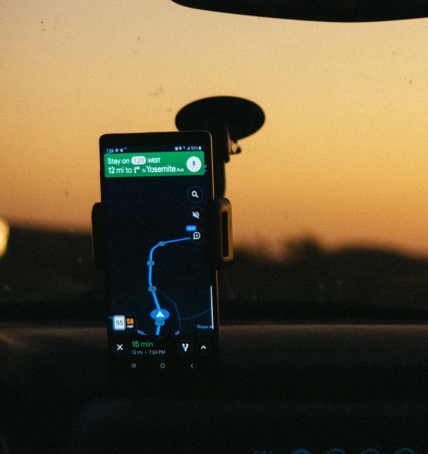
Dark theme UIs can have a subconscious ability to connect a user from their real-life to digital life. For instance, apps that have a day and night mode, like Google maps. When using this during morning times, the UI simply shows everything in a light manner with bright colors. It doesn’t really affect our eyes since there is an abundance of natural light surrounding us. When the sun sets in real life, the UI darkens and signals that we are transitioning into the evening. Not that we need to be told it is night, but this detail gives off an immersive experience that could potentially make a user feel more connected with the app.
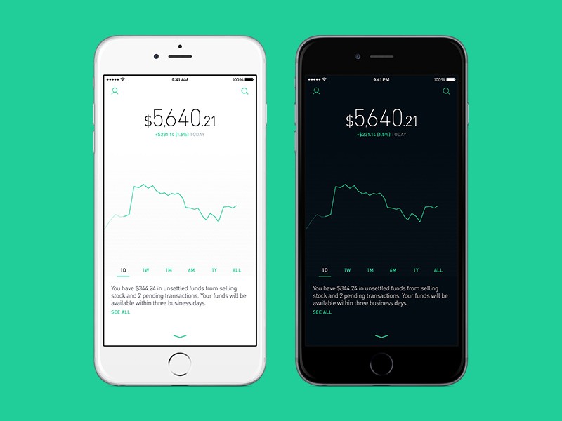
Personally, dark theme mode gives me a sense of calmness. When I use an app like Robinhood (a trading app that has a well built UI/UX) in the morning, with it’s bright and rich colors, it creates the hustle and bustle of the market like I’m on Wall Street. When the sun goes down, the app darkens in a more subdued state and, I feel it giving me a sense of relaxation while I browse for companies that I’m interested in.
The Force is with You
Understanding these UI tactics has opened up my eyes to how I should design user interfaces in the future. It is all about creating a great experience for the user, and I think the dark theme UI creates the best experience. It’s not just aesthetically pleasing, but it helps connect our lives to the digital world that many of us are already engulfed in. Personally, I have already gone to the dark side, and if given the choice, I would auto-enable this feature for all my applications. However, UX Planet says that for the best UX, you should allow your users to choose when they can enable a dark theme.
If you are a dark theme lover like me, I welcome you to the dark side!


