The Importance of Negative Space
Something that I learned back in my Graphic Design days was the importance of utilizing negative space in a design. Often designers (including myself) try to fill in as many design elements inside of a set real estate not knowing that it ultimately convolutes the overall message of the design. It took me some time to understand how negative space can help create groupings, add emphasis and improve legibility. Having an understanding of these concepts has made me a better designer today.
What is Negative Space?
Negative space is the area around a design that is not taken up by things like text, graphical elements, images, etc. For example, look at this Nike image below. Notice how there’s the big bold text bottom left and a whole lot of negative space on top of it. This is a perfect use of negative space that works in unison with the background image. It helps create an emphasis on the overall message while also giving the background image it’s space to shine. Very clear and concise.

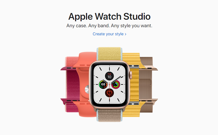
Another great example is Apple. They are the masters at this. They seem to always know what the message is and put the utmost importance on their product. Here you can see how straight forward they are with this graphic. You have your text describing what it is, how you can customize it and a super vibrant image of the product. Notice the negative space on the left and right sides. Negative space is underrated because a lot of companies would try and fill in that space with more marketing text/design. But not Apple. Apple lets its product do all the talking.
Clarity in Negative Space
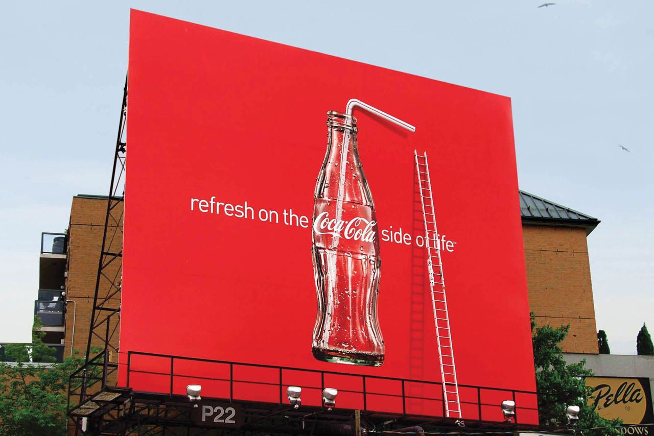
Avoiding needless clutter is a skill that is very important. It’s easy to over-design something when your creative juices are flowing. But, you should always take a step back and ask yourself — is this really necessary? In this instance below with the Coca-Cola advert, less is more and simplicity is key to help give clarity to this design. It truly looks refreshing.
How to design with negative space
As you can see from the examples above, there’s a clear pattern. It takes the right amount of padding to create the necessary space around either text, image or product. This allows the overall design/message to become the main focal point. To help with negative space, keeping the background simplistic is key and also gives you room to move your design elements around freely.
Conclusion
Understanding spacing and having breathing room around the design elements will help in almost every facet. From print, web to now UI, it has helped me in my career and is a great skill that every designer should have.