How Illustrations & Imagery Compliment UI in Mobile Design
Ever wonder how a mobile user interface shines and gives you such a delightful feeling? A reason for that can be illustrations whether in 2-D, 3-D or photographic images. These design choices are super important when trying to balance out a UI with just enough graphical elements to set the tone for a great user experience.
Here you can see how simple the UI is with just a mere couple elements in the burger menu, main navigation, content cards, etc. This allows the 2-D illustrations to take center stage and sets the tone of what the app is all about. We can see from all of the talking bubbles and people that it has something to do with communicating and messaging. The overall balance of this simple, intuitive design paired with an equally simple illustration works well in harmony.

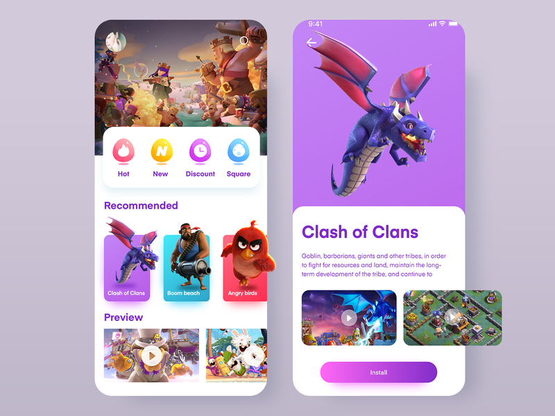
For this example, the 3-D illustrations are so powerful that you do not notice the UI as much as you notice the layout -and it still works because of its simplicity. From the vibrant colors to the polished characters, the illustrations here did most of the legwork in terms of the overall design.

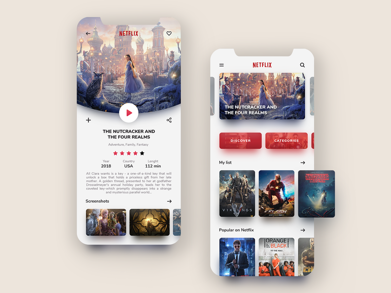
In this UI, movie images are clearly leading the way and give you an immersive feeling that you’re in a library of movies. This is done quite well with clean spacing/formatting, clear titles/categories and of course amazing images. Finding the balance of UI elements, intuitive layouts and imagery is the key here and I feel like this designer did a great job encompassing all of that.
I hope these examples give you an idea of how to utilize different illustrations and images so that your UI design skills will further enhance and in turn give your users an overall better experience when using your app.


