Pressure Indicating UI
“What feature should we build next?”
It’s a common question from product owners, and it’s not always easy to answer. The feature backlog is a mile long — which one will give you the most bang for the buck? Which one do customers want the most?
There’s many ways to measure customer demand for a planned feature: user surveys, public voting, support feedback, social media. But all these approaches have a common shortcoming: they rely on users telling you what they want, rather than showing.
And the cardinal rule of user feedback:
“Everybody lies.”
Stated vs. revealed preferences
It’s tempting to rely on tools like surveys to gauge customer interest. It’s simple, direct, and obvious: just ask them what they want.
But users aren’t always consciously aware of what they want or able to clearly articulate what that is. As the apocryphal Henry Ford supposedly said:
“If I asked people what they wanted, they would have said a faster horse.”
Economists refer to this phenomenon as “stated vs. revealed preferences”. It’s the idea that captures contradictory behavior, like when someone says they want to lose a few pounds, but goes back for a second helping of dessert. Their stated preference (to lose weight) is contradicted by their true, revealed preference (to eat dessert).
Capture revealed preferences with “pressure indicators”
So revealed preferences help show us the customer’s true intent, but how do we figure out what that is? Since we can’t simply ask, we need to be creative.
Let’s say you are building a CRM SaaS product that helps salespeople track leads and close opportunities. You’ve heard some requests from customers to include an in-app dialer that lets salespeople place phone calls directly from the app. How can we know if these requests are stated or true preferences?
Use pressure indicating UI.
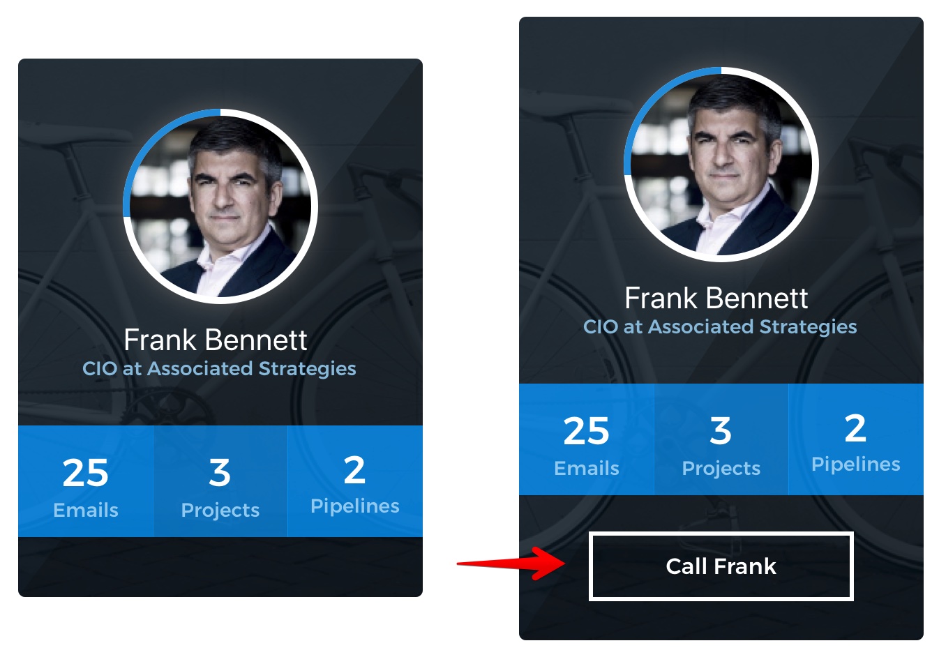
What is a pressure indicator? It’s a UI element that helps capture user preference by allowing users to reveal it with intentional action. The simplest example might be something like this:

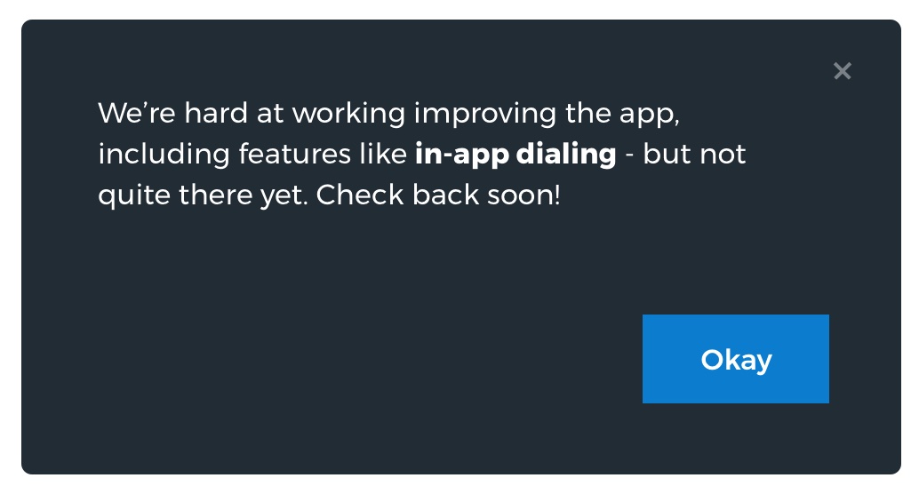
The key is what happens when the user clicks on the “Call Frank” button: we fire off an analytics tracking event, and show a modal like this:

Note that we didn’t build the full, complex feature of an in-app dialer. All we did here is add a button and a modal — a trivial effort by comparison.
The goal here is to sort out whether the in-app dialer is a feature that users actually want vs. what they think they want. By providing an avenue for users to express intent through their actions rather than their words, we can be far more confident that the results reflect reality.
Why are these called “pressure indicators”? Because the level of activity you see on something like the “Call Frank” button gives you a sense of the force of user preference behind it. If you add that button and are overwhelmed with users attempting to use it, it’s a strong indicator that lots of users are bumping into that particular boundary of your product’s feature set.
Capturing more intent
In the above example, we captured the intent of the user to use the in-app dialer feature. This is a huge improvement over simply asking users if they want it — but we can do even better.
In that example, all we captured was binary intent: yes, they tried to use the feature, or no, they didn’t.
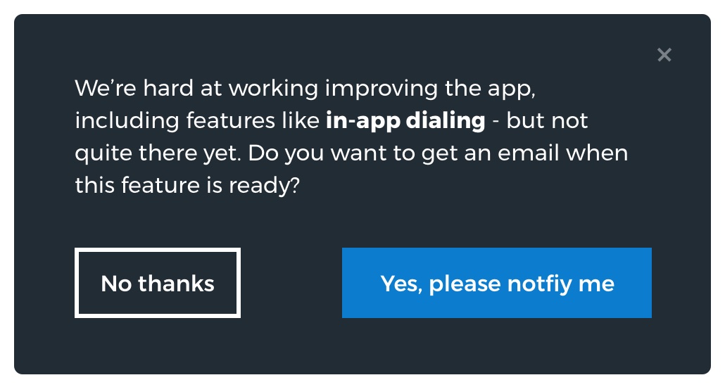
With a subtle tweak of the modal, we can capture more:

By offering to notify users when the feature is ready, you get two important benefits:
- Stronger indicators: by comparing the ratio of how many people clicked the “Call Frank” button vs how many signed up for notification, we can get a clearer sense of how many clicks were exploratory vs. earnestly attempting to use the feature.
- Feature launch marketing list: anyone who signs up to be notified is sending a strong signal that they are deeply interested in this feature. You could craft a special email campaign targeting these users when the feature rolls out, aiming to convert them to customer evangelists.
Avoiding User Frustration
Capturing revealed preferences is tricky, because users must think that they have a chance to use the feature — otherwise, you end up capturing stated preferences instead.
The risk here is user frustration — in our example above, if a user planned to call Frank through the app after seeing the button, they might get frustrated if they attempt to place the call via the apparent in-app dialer. Instead they are greeted with our modal and have to fumble to find the phone number and manually dial.
There is no simple rule for this, but in general, try to keep a few things in mind:
- Bail early: you want to let the user know the feature doesn’t exist yet as soon as possible in the process, so they don’t invest more time or mental effort than necessary going down a dead-end path.
- Users may be busy: be sure to think through scenarios where the user might be trying to use the feature in question, and make sure the pressure indicator UI doesn’t become disruptively misleading. For example, don’t show a “Rollback deploy” button on your Heroku competitor as a pressure indicator — no one wants to find out that feature isn’t finished in the middle of a bad deploy.
- Only show existing users: be careful not to use pressure indicating UI in marketing materials aimed at potential customers. You don’t want someone signing up thinking the feature is available, only to discover a bait-and-switch.
Work smarter, not harder
Pressure indicating UI is all about approaching product design from an intentional, focused perspective. By understanding users’ true preferences, we can build the product they need that makes their lives better, with fewer false starts for our teams.
Want to chat more about how to add pressure indicating UI to your app, or product design in general? Feel free to reach out on Twitter!


