 Back
BackStyling with :focus-within
We’d like to share how one CSS pseudo-class can change the way you style forms. That pseudo-class is :focus-within.
What is :focus-within?
The :focus-within CSS pseudo-class represents an element that has received focus or contains an element that has received focus. In other words, it represents an element that is itself matched by the :focus pseudo-class or has a descendant that is matched by :focus. (This includes descendants in shadow trees.) — MDN Docs
Or, succinctly:
It selects an element if that element contains any children that have :focus. — Chris Coyier
How can I use it?
There are many creative use-cases for this pseudo-class; a common use-case is applying focus styles to the parent of a focusable element. Here are a couple of examples:
- Input field with icon and button
In this example, the container element uses a class .input-wrapper to identify itself as the parent of focusable content.
<div className="input-wrapper">
   <i className="fas fa-search" />
    <input
      id="input"
      placeholder="What are you looking for?"
      autoComplete="off"
    />
    <button>Search</button>
</div>
With that class handy, we can target the parent to display styles whenever one of its children is focused.
.input-wrapper:focus-within {
  /** Add desired outline, focus styles here */
  box-shadow: 0px 0px 10px 0px var(--primary-color);
  transition: box-shadow 250ms ease-in;
}
Click to see the full source code here.
When either the input or button is focused, the parent “container” element displays an animated box-shadow to give visual focus.
2. List of items with focusable content
Here’s an example to demonstrate the usefulness of this particular pseudo-class. A list of forms is displayed, and when an input field or button is focused, the individual list item is highlighted with a different-colored background to indicate focus.
Providing location context to your users is considerate, pragmatic and delightful.
This is how it’s achieved in the code:
// index.html
<ul>
  <li>
    <h2>Item 1</h2>
    <form>
      <label for="field-1">Field 1:</label>
      <input placeholder="focus me for styles" name="field-1" />
      <button>button</button>
    </form>
  </li>
</ul>
// styles.css
li:focus-within {
  background: #f7dce9;
}
Click to see the full source code here.
By attaching the :focus-within pseudo-class to list items, the list items are listening for any descendants who are focused, and then applies its styles. In this instance, the background color of the list item updates to be light pink.
For effect, we can take it a step further. When any element within the form is focused, the button color also changes. This is done by targeting the button when the list item detects any focused children.
li:focus-within button {
  background: #9dddca;
}
Conclusion
There are so many creative possibilities out there using :focus-within. We encourage you to see how you can improve your styles and explore your creativity with this handy trick!
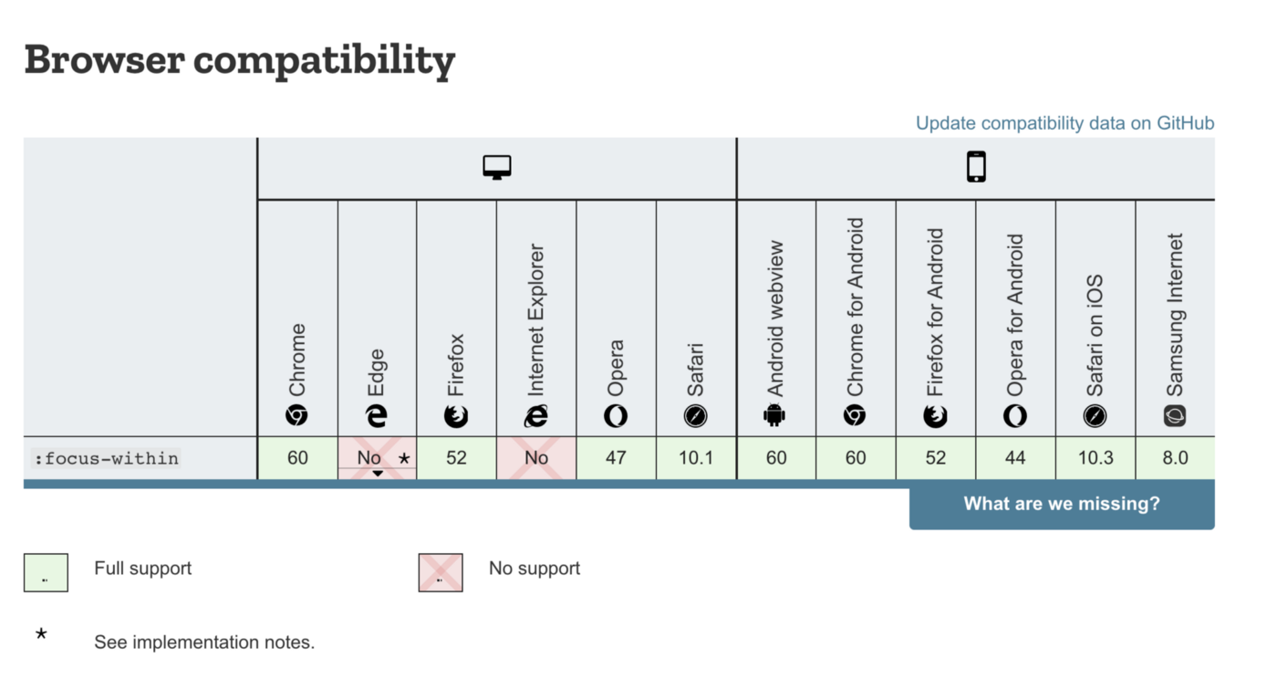
Note: There is no support for IE or Edge.