 Back
BackCreating Custom Icon Fonts in React Native and Expo
Icons are a common UI element used to provide visual information and cues to users of what an element represents. In React Native apps, we’re given a number of options when it comes to free and open-source icon sets to apply to our projects, such as FontAwesome, Google Material Community Icons, Ionicons, and more. While there are countless options for us pre-packaged, sometimes the options available don’t fit the design or a design system introduces a custom icon set just for the project. So what are our options then?
Generally, there are two routes developers take. The most common route is to create these icons via SVGs. While this is a popular solution, this could be cumbersome to set up and difficult to maintain if the custom icon set grows in time. Most of the time SVGs are handled as an individual component. Icon fonts are still a great choice for large-scale custom icon sets to scale over time. They:
- Automatically scale.
- Can be referenced directly from the same Icon component, making them accessible with all of those icon sets into the same package.
- Are hosted in a single file locally or on a CDN and you can easily choose any icon to display using the corresponding class or code (or Glyphmap).
Of course, icon fonts do have their limitations such as:
- Icon fonts don’t support multiple colors. An icon can only be styled one color at a time.
- Limited animations. Unlike SVGs, where each path or element can be animated individually, icon fonts cannot be treated the same way because they are not vectors.
If icon fonts fit your needs, fortunately for us react-native-vector-icons already provide an easy way to create custom icon sets. So let us get started:
The tools you’ll need:
- React Native Vector Icons — If you’re using Expo (managed or bare workflow), you can utilize the Expo wrapper for react-native-vector-icons https://docs.expo.dev/guides/icons/?redirected#createiconset. Otherwise install react-native-vector-icons directly: https://github.com/oblador/react-native-vector-icons#custom-fonts)
- Nucleo Icon Manager https://nucleoapp.com/ (Free desktop app for Mac/Windows) — For this article, I chose to utilize Nucleo Icon Manager app. There are other popular SaaS SVG and icon managers (both desktop and web) to choose from such as Fontello and Icomoon. However, these have their own configurations with React Native Vector Icons, and for this article, I wanted to focus on how to convert SVGs to icon fonts without these SaaS.
- For demo purposes, I’ll be using the Helium SVGs to convert to icon fonts, but you may wish to use any custom SVGs of your choosing.
Setting up your project
For this example we are using the Expo workflow, Expo already bundles a wrapper around react-native-vector-icons in the [@expo/vector-icons package](https://docs.expo.dev/guides/icons/). You just need to import the modules directly into your projects like so in the root file:
// App.tsx
import { createIconSet } from '@expo/vector-icons';
For projects not built with Expo, you can still follow along and install the react-native-vector-icons the package is as you would expect for a React Native app:
$ yarn add react-native-vector-icons
Generating Icons with Nucleo
With @expo/vector-icons set up in your project, you are ready to bring in your custom icons.
With Nucleo installed and opened, we’ll want to create a new icon set by importing our Helium icons (linked above). To create a new set, click the ‘import icons’ button in the top left, or right-click on the left panel > New Set. Another option is to drag your icons over the app (keep in mind you can only import SVG files, all other formats will be ignored). Name the new set and save “Create New Set”.
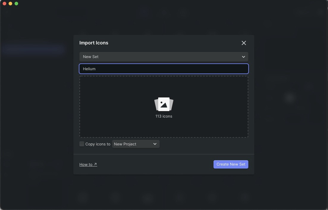
Importing the Helium icon set
Once all of your icons are imported to the Nucleo app you can select them and “Export” the font file (note that the screenshot below it shows the number of selected icons to the left of the highlighted “Export” button):

Nucleo allows you multiple methods of exporting. Select “Icon Font” and configure as needed for the outputted font, including any metadata about our custom font. When you’re happy with it, choose “Export Icons”.
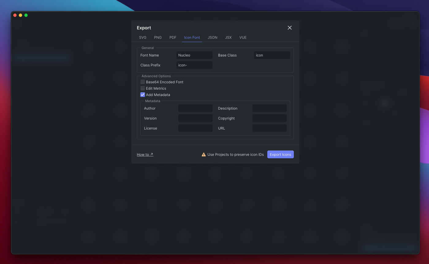
Once exported in this new directory, you’ll be provided with several outputted files and folders. You will want to locate the unicodesMap.json in the root directory, and Helium.ttf inside the fonts directory. Copy these files and locate them to your React Native project codebase, typically within an assets directory.
Using the custom icon font
When importing custom fonts in Expo, it is recommended to make sure your font is loaded before rendering. You can use the useFonts hook (or Fonts.loadAsync for class-based components) before rendering the component. Below is a simple example of importing our fonts into our app.
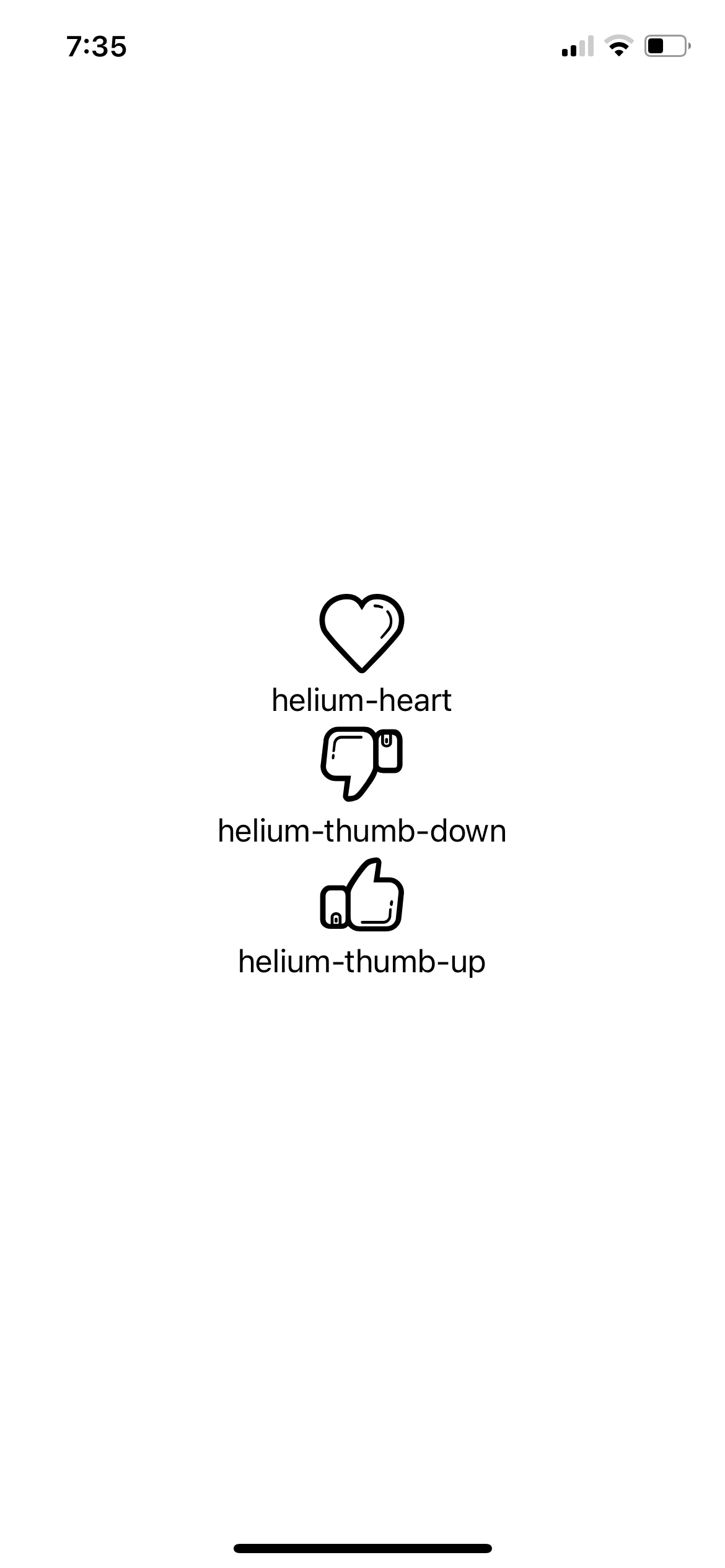
// App.tsx

import React from 'react';
import { Text, View } from 'react-native';
import AppLoading from 'expo-app-loading';
import { useFonts } from 'expo-font';

//If importing icon set directly into App.tsx
import { createIconSet } from '@expo/vector-icons';
const Icon = createIconSet(glyphMap, 'Helium', 'helium.ttf');

import glyphMap from './assets/fonts/unicodesMap.json';

export default props => {
  let [fontsLoaded] = useFonts({
    'Helium': require('./assets/fonts/Helium.ttf')
  });

  if (!fontsLoaded) {
    return <AppLoading />;
  } else {
    return (
      <View style={{ flex: 1, justifyContent: 'center', alignItems: 'center' }}>
       {Object.keys(glyphMap).map((icon, i) => (
        <>
        <Icon  name={icon} size={50} />
        <Text>{icon}</Text>
        </>
       ))}
      </View>
    );
  }
};
It’s also very easy to move Icon as its own component. Since the createIconSet method returns a React component, we can just export it as default in its own directory and file. The Icon component in turn inherits props from vector-icons so you can adjust each Icons color, size, and styling.
// ./components/Icon.tsx

import { createIconSet } from '@expo/vector-icons';
import glyphMap from '../assets/fonts/unicodesMap.json';

export default createIconSet(glyphMap, 'Helium', 'Helium.ttf');
Then in our App.js file, replace the variable we created earlier with our imported Icon component:
// App.tsx

// If importing directly into App.tsx
// import { createIconSet } from '@expo/vector-icons';
// const Icon = createIconSet(glyphMap, 'Helium', 'helium.ttf');

import Icon from './components/Icon'

...
And that should be it! You should be able to load your app and see your new icons. Easy peasy!
You can find an example of the tutorial here for further reference and experiment more with custom Icon fonts.
Learn more about our React Native capabilities.